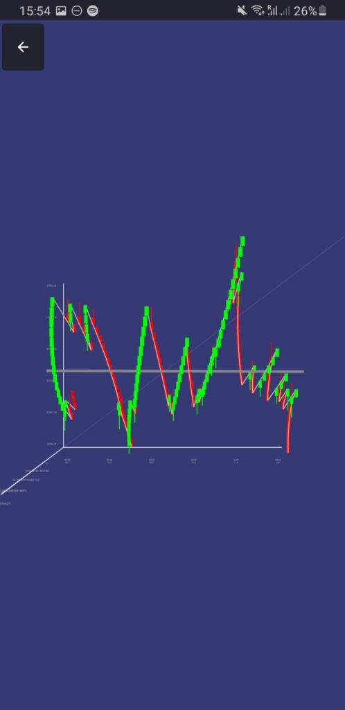
Short-term RSI of Renko chart in 3D
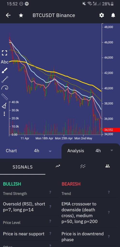
RSI evaluates overbought or oversold conditions, where the price is expected to reverse. Here, we apply short-term RSI to the Renko chart, which (Renko) does not use standardized time intervals but rather price movement, and plot it in three dimensions (3D), where time is X axis, price is Y axis, and RSI is Z axis. Such transformation enables trader to see overbought and oversold conditions more clearly and observe outliers.
A little bit about Renko chart
A Renko chart is a chart that is built using price movement rather than both price and standardized time intervals. Renko charts filter out noise and help traders to more clearly see the trend because all movements that are smaller than the box size are filtered out.
As a result, one candle can represent ANY time period BUT fixed price movement, e.g. one candle can represent an hour or month BUT it is the same fixed size. A new candle is created when the price moves a specified price amount so-called box size.
So, in order to generate Renko chart the following input settings are needed:
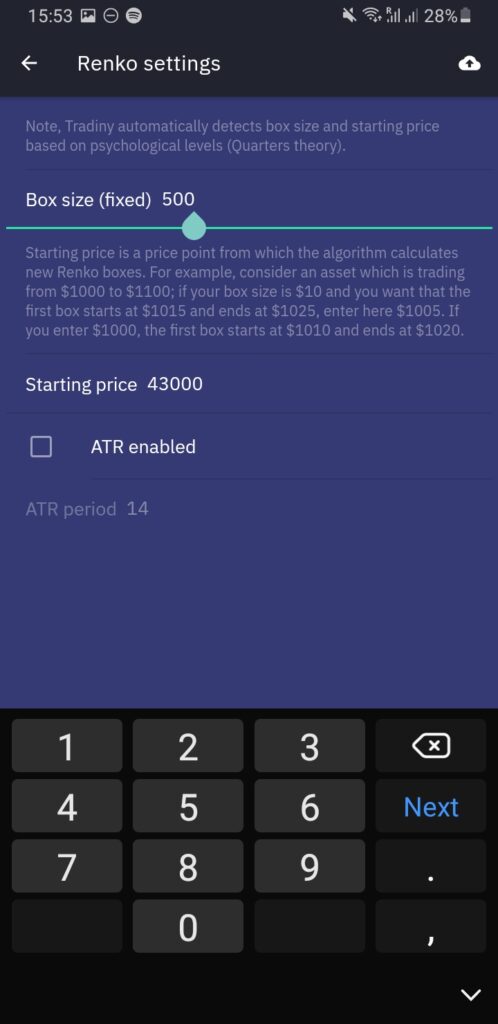
- Box size – price amount of one candle
- Starting – price point from which the algorithm calculates new Renko boxes. For example, consider an asset which is trading from $1000 to $1100; if your box size is $10 and you want that the first box starts at $1015 and ends at $1025, enter here $1005. If you enter $1000, the first box starts at $1010 and ends at $1020.
Note, it is also possible to have dynamic box size of ATR.
In Tradiny, open a chart and tap on three dots in the left menu and tap on Renko chart, choose box size, starting price and confirm.
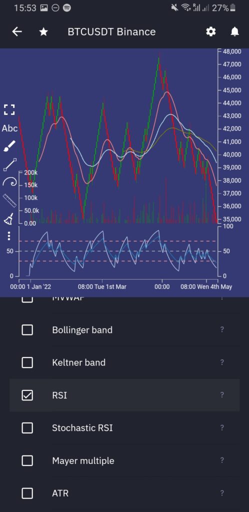
Conveniently, Tradiny calculates analysis from Renko chart data, so we can enable RSI right away in indicators.
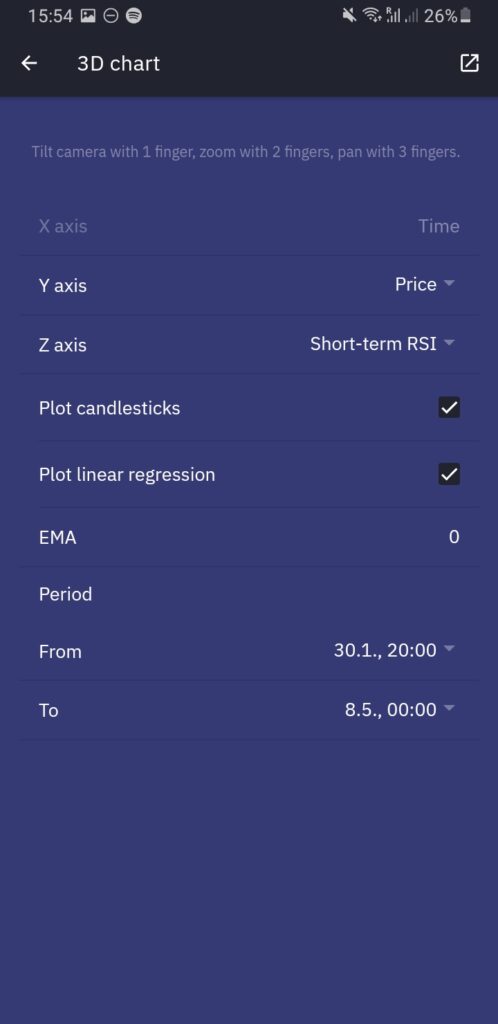
Plotting Renko chart in 3D
Compared to common 2D charts, 3D gives an extra dimension to observe chart from different angles and explore patterns such as spirals.
In this article, we use the extra dimension for short-term RSI calculated from Renko chart.
To do this in Tradiny, tap on three dots in the left menu and tap on 3D chart, choose short-term RSI as Z axis and confirm.

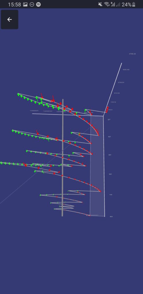
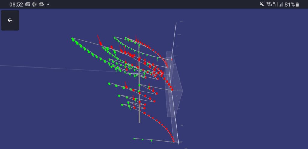
3D chart analysis
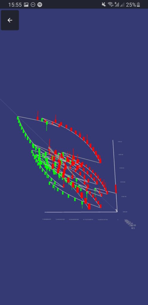
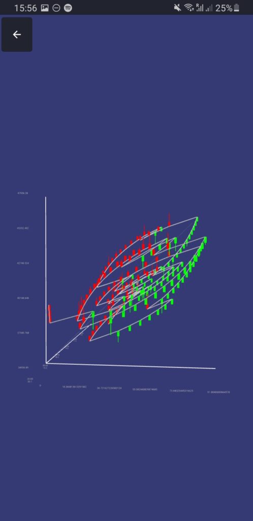
As can be seen from the sides, the chart forms ellipse-like shapes with red tops and green bottoms, highly resembling an eye.
In Chart 4, the current price is entering a rectangle from which the price pulled highly to the upside, so traders can expect a reversal soon. There is still place for some downside movement, but the red bottom is almost formed and a new green top will seem to start form soon.
… and after two days, the price did as expected.
Key takeaways
- Renko charts simplify market movements because all movements that are smaller than the box size are filtered out.
- As a result, oversold and overbought regions in RSI calculated from the Renko chart are more clear.
- 3D chart enables observation from different angles where trader can observe various patterns such as spirals.
- In this example, Renko chart in 3D with RSI as Z axis forms ellipse-like shapes highly resembling an eye.