Trading Basics: Trend
Trend
Trend defines an overall direction of the market, which can be identified by looking at the last 300 candlesticks on the chart.
There is a number of indicators which can help to identify a trend:
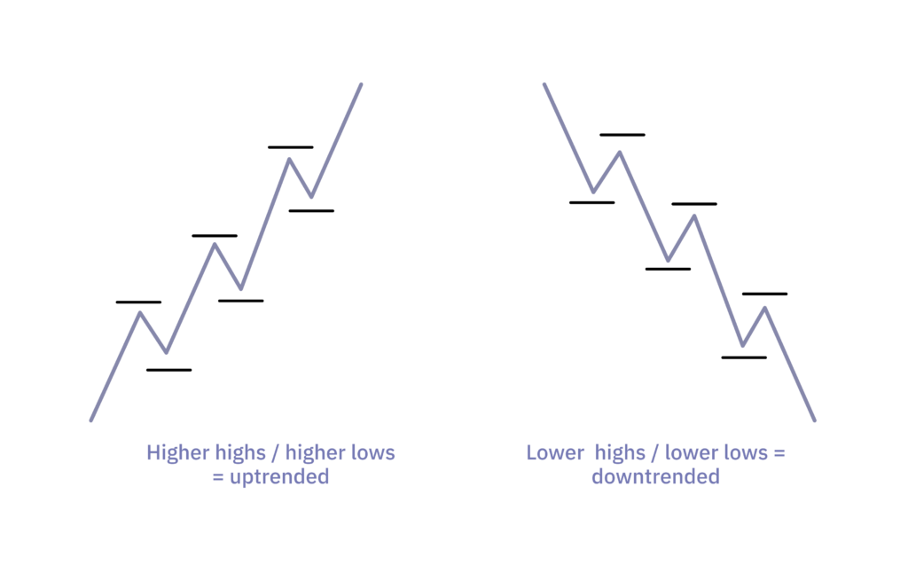
Higher highs / lower lows. If the asset forms higher highs and lows, it is an uptrend and vice versa—if the asset forms lower lows and highs, it is a downtrend. Note, the indicator that can be utilised to find a trend based on highs / lows is called raw market movement or zig zag.
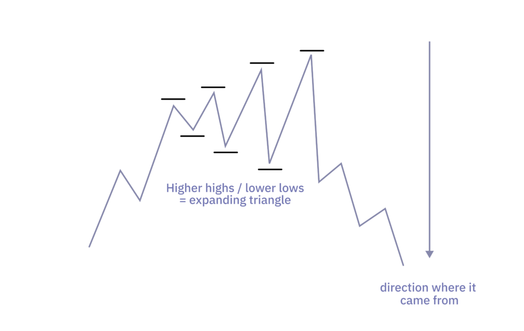
It is important to mention the expanding triangle pattern. If the pattern is forming, it produces a lot of false signals to the trend definition based on higher highs / lower lows. Traders should be aware of this.
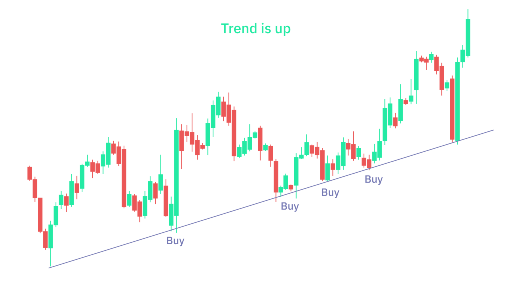
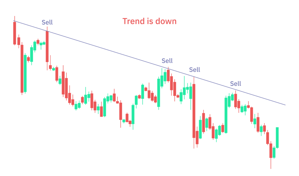
Above / below trendline. If the asset holds a bullish trendline, it is in an uptrend. In the same way, if it holds a bearish trendline, it is in a downtrend.
Price above / below exponential moving average (EMA). EMA calculates an average price based on historical prices. There are 4 commonly used EMA periods:
- Price above / below EMA with period 20 denotes strong short-term up / down trend,
- period 50 denotes medium-term market trend,
- period 100 denotes medium-to-long term trend,
- period 200 denotes weak long-term market trend or also average (“fair”) value of the asset.
Note, this is a lagging indicator.
Note 2, the unit of period depends on the time frame, for example period 20 on the 1h chart means that the EMA value is the average value from the last 20 hours.
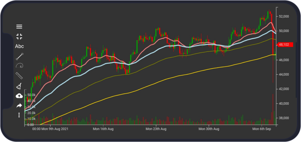
In the picture, the gold line is EMA 200, the olive color is EMA 100, the sky blue is EMA 50 and the pink one is EMA 20.
EMA crossover / near EMA crossover. EMA crossover (when EMA with lower period crosses EMA with higher period) is used to confirm a trend because it is a lagging indicator.
Golden cross (cross to the upside) signals that the asset is in an uptrend and death cross (cross to the downside) indicates that the asset is in a downtrend.
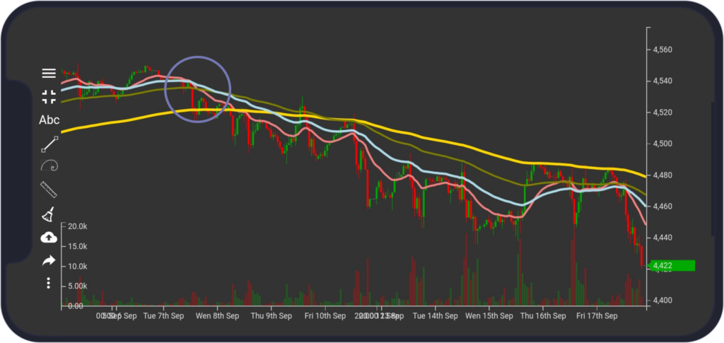
Hull moving average (HMA) raising / falling. HMA reduces lag and improves smoothing compared to EMA. However, traders are often using EMA, and as a result, it is important to follow EMA too.
If HMA is rising, the asset is in an uptrend and vice versa, if it is falling, the asset is in a downtrend. Note, this is also a lagging indicator.
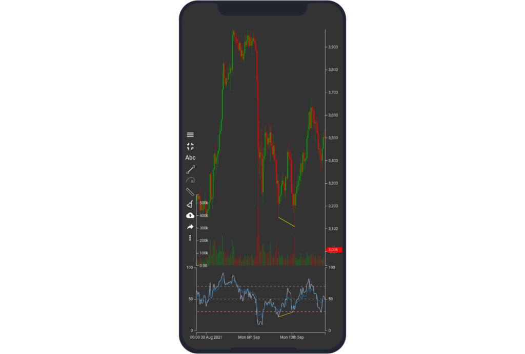
In the image, HMA with p=200 is drawn. The beginning of a downtrend can be spotted around 8th of Sept where the HMA is falling and the price broke previous low.
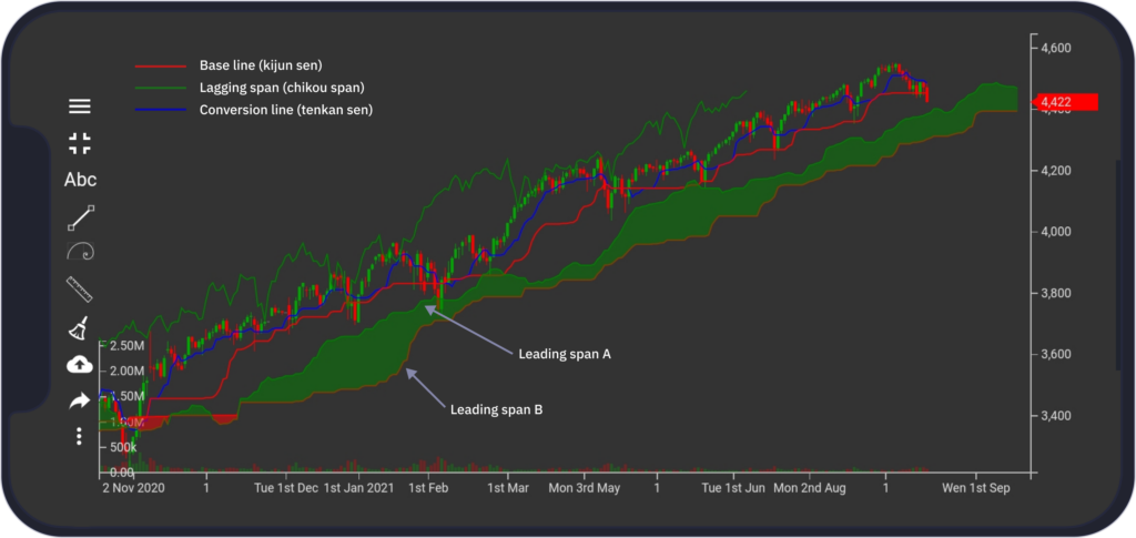
Above / below Ichimoku cloud. The Ichimoku cloud shows support and resistance levels, momentum and trend direction. It does this by taking multiple averages and plotting them on a chart:
- Conversion line (tenkan sen) - the green line
- Base line (kijun sen) - the blue line
- Lagging span (chikou span) - the red line
- Leading span A (senkou span A) - the band of the cloud (green)
- Leading span B (senkou span B) - the band of the cloud (red)
If the lagging span (the green line on the figure below) is away from the price (lagging span is a line which is the price 26 periods behind the latest price), it means that the asset is in a trend.
The price above the cloud (the green area on the figure formed by two lines - the green one and red one) signals an uptrend and the price below the cloud signals a downtrend.
Big money. Follow traders with big volumes.
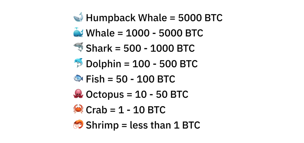
Difference between retail and big traders
Think of the market like the ocean. There are fishes and creatures of all sizes – from “Humpback whales” equaling to high-net-worth individuals to “Shrimps” with an insignificant amount of assets. If leading investors make financial decisions, it will probably have an impact on the rest of the market depending on volatility.
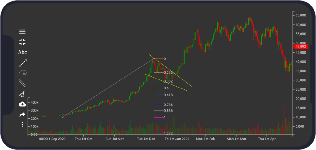
Thanks to the transparency of crypto payments, people can see the movement of capital and payments of market participants. For example, on the Blockchain, it is possible to see transactions from one BTC wallet address to another or even from/to an exchange. Besides that, it is possible to see the transferred amount of bitcoins. If a key player (“Humpback Whale”) in the market is selling its assets, this can be an indicator of the falling market. There is a couple of services which can help traders to track whales
https://www.google.com/search?q=whale+alert
Trend Strength
Exhaustion vs recovery. After identifying the trend and its direction, traders should be able to predict whether the trend will continue, and that the market is not exhausted, and it is rather in recovery (and the trend resumes), because they do not want to buy tops of an uptrend or sell bottoms of a downtrend.
It is not always easy to differentiate between recovery and exhaustion. If the market is in recovery, the trend will most likely resume, and here traders want to enter, however if the market is exhausted, traders probably want to wait for the next price action, rather than enter in the consolidation when the trend ends.
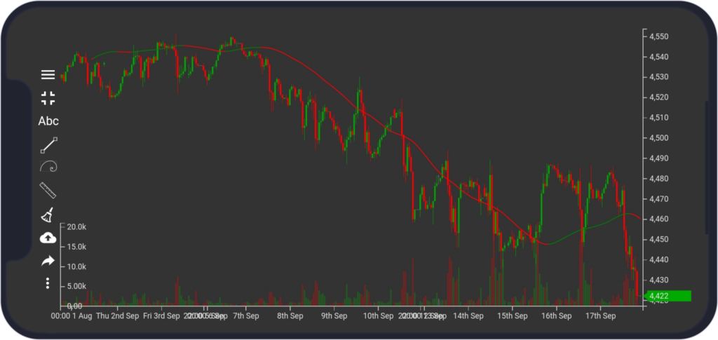
Basically, exhaustion can be spotted when the market is forming higher highs, so it seems to be in an uptrend, but they (higher highs) are weak compared to the previous ones, and the asset can even form a lower high (even a head and shoulders pattern can form here). When the asset forms weaker and weaker highs, it means that buyers are losing control and it is advised to not buy.
Recovery can be spotted when the market forms a wedge / channel pattern on the top of the trend (see below) or the price is in a triangle.
Here, the price usually reacts well to Fibonacci retracement levels. Breaking out of the wedge or triangle to your direction is a signal to buy into the market. Please see the section about Fibonacci retracement and extensions.
On the chart above, we can see exhaustion on the right part of the chart. The price moved a little two times from previous high and later even formed a lower low and lower high. In this case, traders expect a downtrend.
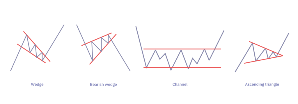
Channel is a pattern where price stays inside of two perpendicular lines for some time, so-called upper and lower channel lines
Many indicators can help with recognizing the strength of trend:
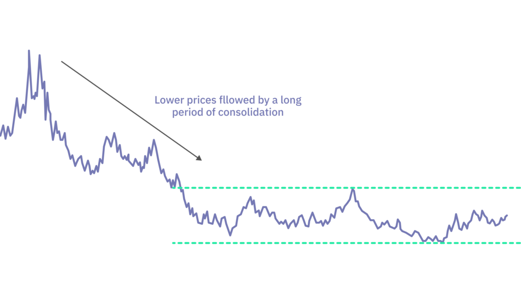
Consolidation phase / sideways market movement / channels or wedges. Basically, any consolidation is healthy after a run up/down because sellers (in an uptrend) are weakening and the trend can resume to higher highs. The consolidation phase makes the market more stable, because if the market is trending without any consolidation for a long time, at some point, sellers overtake and a big dump is coming because many traders are taking profits.
Here are some of the most common signals that indicate that the trend ends in the consolidation:
1) Traders should be cautious when the market breaks previous low or high in the previous runup in an uptrend. And vice versa for a downtrend.
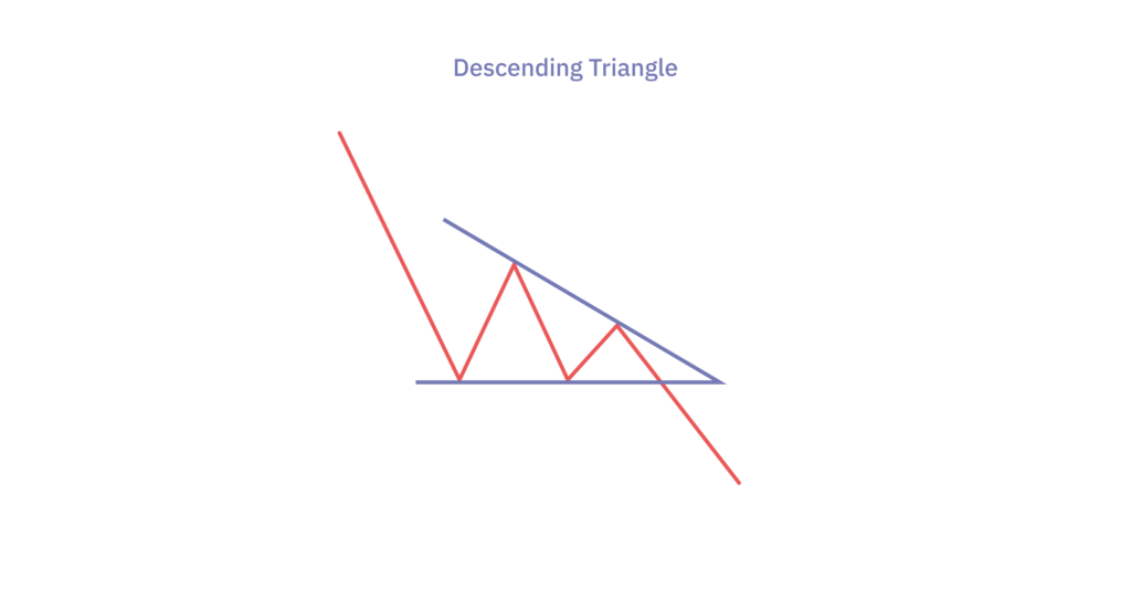
2) It is also very common that a descending triangle does form in the consolidation, signaling that an uptrend may end. And vice versa for a downtrend.
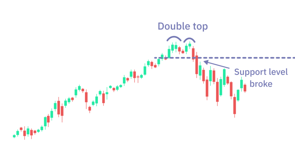
3) It is also advised to look at lower time-frames (lower than the one trader is looking at) and look for reversal signals such as double tops / head and shoulders in the consolidation.
Continuation patterns such as triangles. If an ascending triangle or also symmetrical triangle forms in an uptrend, buyers are stronger than sellers because the market is forming higher lows to a level which is weakening with each test, and as a result, the trend most likely resumes.
Relative Strength Index (RSI) oversold / overbought.
The relative Strength Index (RSI) measures the speed and change of price movements to evaluate overvalued or undervalued conditions.
Overbought and oversold market: Important values are 70 and 30 points. If the RSI moves above 70 points, it signals an overbought market, i.e. a likely future decline in the security's price. An RSI value below 30 points, on the other hand, signals an oversold market and the possibility of future price growth of the security.
If the market is overbought based on RSI in an uptrend on a higher time-frame, the trend may be weakening and vice versa for the opposite direction.
(see below for the RSI chart)
Divergence. If the price is forming lower lows on the candlestick chart and RSI is forming higher lows on the RSI chart (so called divergence of price and RSI), it signals that the downtrend is weakening (sometimes it may also signal a reversal) and vice versa for an uptrend.
In the image, the gold line on both the candlestick chart and RSI chart signals divergence - the line on the candlestick chart is falling and the line on the RSI chart is rising.
Near upper / lower BB.
BB is a standard deviation level above and below a simple moving average of the price.
In an uptrend, price near upper BB for some time on a higher time frame indicates that the trend may be weakening because the asset is overbought and vice versa - for the opposite direction.
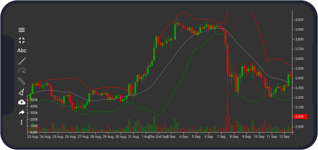
In the image, the red line represents upper BB, gray middle BB, and green lower BB. The overbought condition can be seen from 2nd Sept to 6th Sept, after that, the price dropped.
Trend Guidelines
It is important to:
1) trade with the trend and not against the trend
2) the trend should be confirmed on multiple time-frames
3) the market should not be exhausted so that the trend can resume (we cover this topic later).
4) enter in recovery / consolidation, and not when the market is rocketing up / down (called also catching a knife in a downtrend). Traders generally enter at discounted prices in consolidation and exit at higher prices in an uptrend, and vice versa for a downtrend (note, this depends on a strategy but this is a general rule). They do not buy high and sell low, but rather buy low and sell high.