About Price: Candlestick Chart
Candlestick Chart
Candlestick chart shows historical price movement including the current price of an asset, where X axis represents time and Y axis represents price. Each data point, i.e. a candle, consists of a body indicating opening and closing price (the thick part), and the lines below and above the body, so-called wicks, are indicating the highest and lowest price. If the candle is green, the price went up, and if the candle is red, the price went down. You may also encounter the term OHLC, which is Open, High, Low, Close.
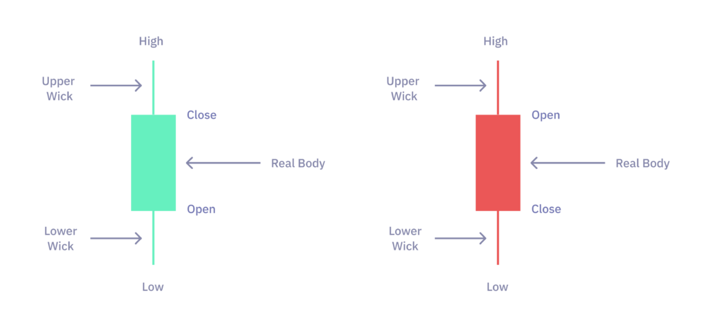
It is important to study candlesticks and candlestick patterns, because it helps to understand price movement. The most basic understanding is that a big wick from the top (upper wick) or a big bearish candle body (compared to the other previous ones) indicates high selling pressure. And vice versa for the opposite direction.
The closing price in the latest candle represents the last price. It is not advised to act based on the last candlestick, because it did not finish yet, but rather it is better to use past candlesticks on lower time frames, which gives more details about price movement.
Note, the closing price in the finished candlestick is important, because it indicates that a specific price level (i.e., horizontal line/area on the chart to which the price is reacting) was held if there was a higher volume, and the wick in the opposite direction was small or it was not formed at all.
Other charts can be plotted on top of a candlestick chart. The most basic setup is to plot a volume chart (which is just a bar chart) on the bottom part, where X axis represents time and Y axis represents volume.
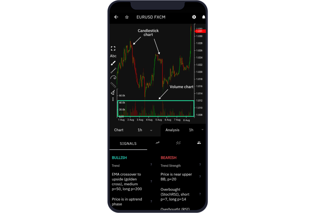
A volume bar represents the total amount of assets being traded (both bought and sold) over the period of time.